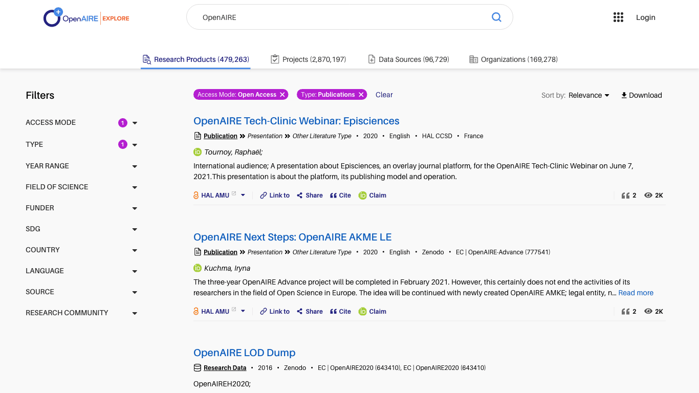
The redesigned search pages enhance the way users find and interact with information, with a more streamlined and minimalistic interface. Users can now find relevant results faster and more easily. Improvements include quicker page load speeds, easier use of filtering and sorting tools, and better-organized metadata for each result. The new design ensures users spend less time searching and more time engaging with important content.
Before
After
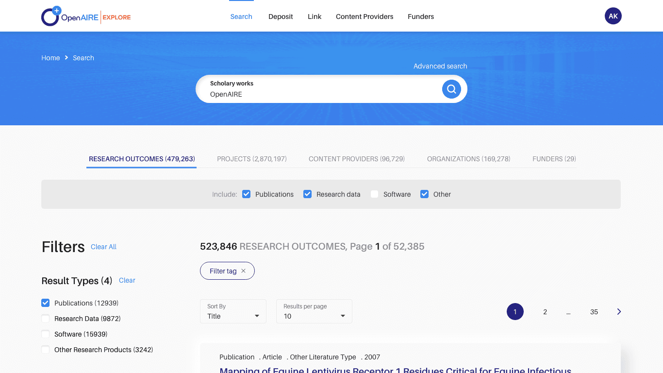
Excessive Information at the Top
The search bar, sorting buttons, paging, tabs, and checkboxes all together pushed the results lower on the page, effectively hiding them from the user.
Complexity and Confusion
Due to the large volume of information, users found it difficult to quickly locate the actions and information they were looking for.
Hidden and Overwhelming Filtering
The numerous filters required extensive scrolling to view, and it was not always clear which filters were already applied.
Large Result Cards
The result cards took up too much vertical space and had somewhat disorganized metadata, making them difficult to read.
GOALS
Description
01/ Immediate Results Display
Improve the layout so that users can see more results immediately upon page load.
02/ Reduce Complexity
Create a more minimal page layout to help reduce user confusion caused by information overload.
03/ Enhance Filter Visibility
Ensure that filters are more easily discoverable and understandable.
04/ Better Metadata Organization
Reorganize metadata to make it easier for users to quickly grasp the essential details.